
How to frame fine art photography — the last decision that matters
How to frame fine art photography — the last decision that matters
There is a moment, after the print arrives and before it goes on the wall, when the framing either completes what the image began or contradicts it. Most people experience this as intuition — a frame that feels right or wrong without being able to say exactly why. That intuition is correct. It is responding to something real.
The frame is not decoration. It is the boundary between the work and the world — the decision that determines how much space the image claims, how the light falls across it, how the eye enters and exits. A frame chosen badly does not destroy a fine art photograph. But it quiets it. And a work that cost thousands of hours of attention to produce deserves more than to be quieted by its enclosure.
Framing is not a finishing touch. It is the last decision the artist makes about the work.
At Pictelier, every work is hand-framed in Amsterdam before it ships. The framing is chosen for each image specifically — not selected from a catalogue, not offered as an option. When the work arrives, it is ready to place. This guide explains why that decision matters, and what to look for if you are framing a fine art photography print yourself.
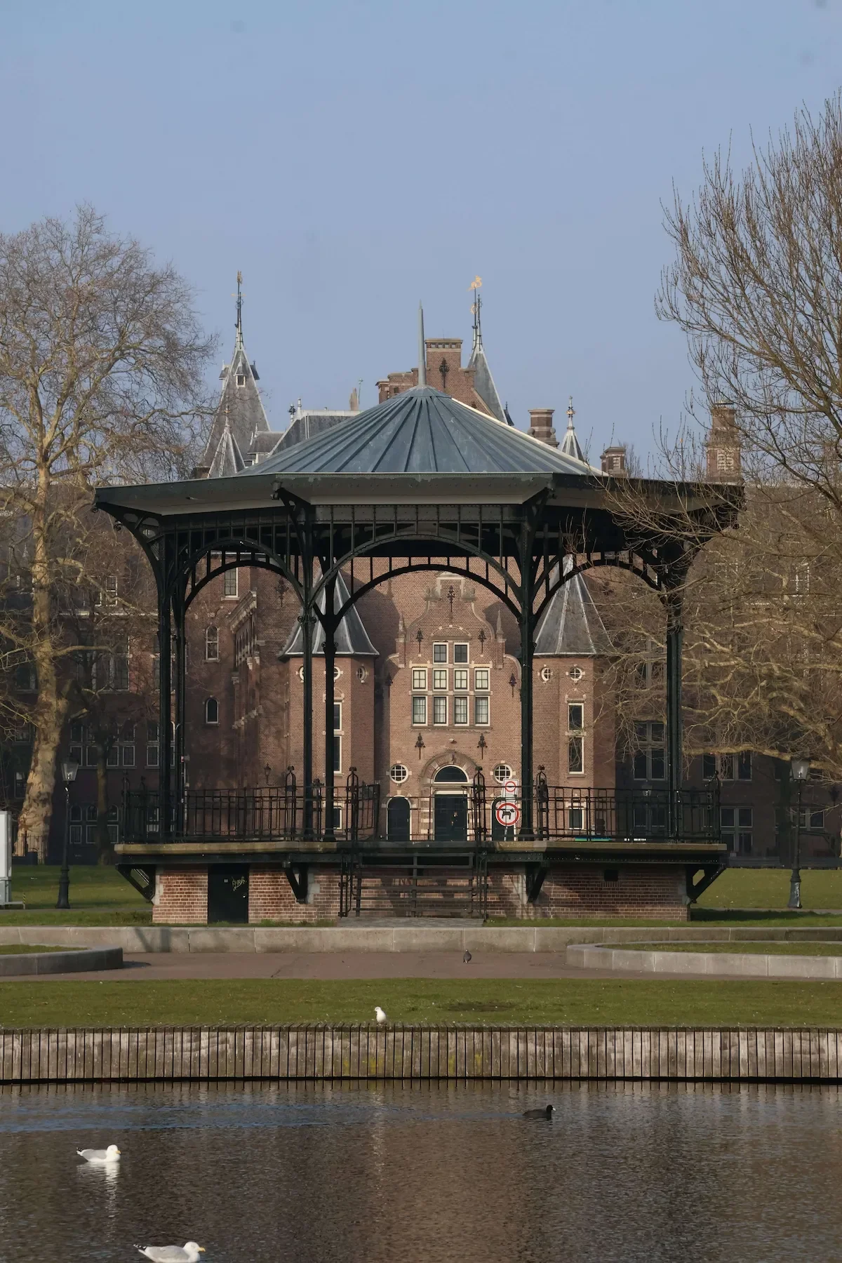
Geometric layers frames within frames Amsterdam architecture, fine art photography framing hand-framed Amsterdam
Why framing matters — more than most collectors expect
The relationship between a photograph and its frame is one of proportion, material, and tone. A frame that is proportionally off — too wide, too narrow, too deep — shifts the visual weight of the image in ways that are felt before they are understood. A frame in the wrong material — a warm wood tone on a cool monochrome image — creates a low-level friction that the eye never fully resolves. A frame that is too decorative competes with the image for attention.
None of these are catastrophic. The image is still there. But the collector who lives with a well-framed work for ten years and then encounters the same image in the wrong frame understands immediately what framing does — not to the wall, but to the work.
The wrong frame does not ruin a photograph. It quiets it.
The goal of framing fine art photography is to complete the image — to give it a border that extends its logic rather than interrupting it. A photograph with strong geometric composition asks for a frame that echoes that precision. A photograph with soft tonality and ambient light asks for something that does not impose. The frame answers the image's question. It does not ask its own.
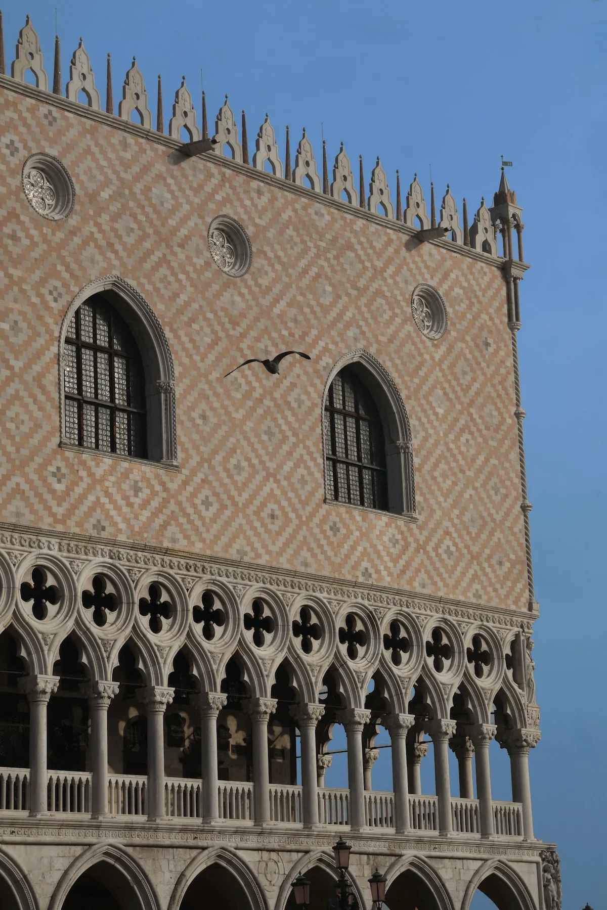
Single bird perched ornate Venetian palace facade geometry, fine art photography archival framing edition of 5
The materials — what conservation framing means for fine art photography
A fine art photography print on archival paper — rated for over a century of stable display — requires a frame that matches that standard. This is what conservation framing means: materials that will not damage the print over time. Acid-free mount board. UV-protective glazing that blocks the wavelengths that cause fading and colour shift. A backing that breathes. Fixings that allow the print to expand and contract slightly with changes in temperature and humidity without buckling.
The glazing choice matters significantly. Standard glass filters some UV but not enough for long-term display. Museum-grade UV-protective glazing — such as Tru Vue Museum Glass — blocks over 99% of UV radiation while maintaining exceptional clarity. The difference is visible: a work behind museum glass reads more like a print on a wall than a print behind glass. The reflections that interrupt the image in standard glazing essentially disappear.
The mount — the border between the print and the frame — should be acid-free and cut to a depth that gives the print room to breathe visually. A mount that is too narrow makes the print feel compressed. One that is too wide makes it feel lost. The proportions are not arbitrary. They are part of the decision.
A frame should complete what the image began — not announce itself.
At Pictelier, the framing decision is made with the same attention as every other decision about the work — materials, proportion, finish. The frame is not an afterthought. It is the last step the atelier takes before the work leaves Amsterdam. A work issued with a certificate of authenticity deserves a frame chosen with the same intention that produced the image.

Empty Amsterdam theatre stage winter light, fine art photography conservation framing museum quality
Colour and tone — choosing a frame for fine art photography
Black frames for fine art photography
Black is the most common choice for fine art photography and the most frequently correct one. It does not introduce colour into the relationship between the image and the wall. It creates a clean boundary that separates the work from its environment without competing with it. For monochrome photography — where the image itself is constructed from a tonal range without colour — a black frame extends that logic to the boundary.
The depth and finish of a black frame matter. A flat matte black recedes — the eye moves past it to the image. A gloss black reflects — in some contexts this creates energy, in others it competes. A deep profile adds weight and presence, appropriate for large format works. A thin profile is appropriate for works where the image itself carries the visual weight.
Natural wood and warm tones
For photographs with warmth in the tonality — golden light, amber tones, the particular quality of late afternoon in Amsterdam or Venice — a natural wood frame can extend that warmth to the boundary of the work. The risk is that it can also make the frame visible in a way that pulls attention from the image. The test: does the eye rest on the frame or pass through it? If it rests, the frame is competing.
White and off-white
White frames work well for high-key images — photographs with significant areas of light tone where the frame continues the visual logic of the image. They are also appropriate in gallery-style installations where the frame becomes part of a white wall presentation. The risk is that they can read as decorative in a domestic space rather than curatorial.
What to avoid
Ornate or decorative frames — gilded, carved, heavily profiled — rarely work with contemporary fine art photography. They impose a historical register on images that have their own authority. The image does not need the frame to announce that it is art. The image already does that
Venetian staircase between floors light shadow geometry, fine art photography hand-framed black frame
Size and scale — how framing changes with format
A print at 30 × 45 cm and a print at 60 × 90 cm are not the same object at different scales. They are different relationships with the room they enter. The framing needs to be recalibrated accordingly.
At smaller sizes, a thinner frame profile keeps the work from being visually overwhelmed by its enclosure. The mount depth becomes proportionally more important — it is the breathing room that allows the image to assert itself despite its smaller scale. At larger sizes, the frame needs more presence. A thin profile on a large format print looks provisional, as if the frame was not chosen for the work but found nearby.
At Pictelier, works are available in three sizes — S, M, and L — each framed specifically for that format. The framing decision for a size S work is not simply a smaller version of the size L decision. It is a separate decision about how that image reads at that scale. For a full understanding of how edition size and format relate, the guide to fine art photography prints covers the relationship between scale, materials, and collectible value.
Placing the work — where framing meets the room
The frame connects the work to the room it enters. This means the framing decision cannot be made in isolation from where the work will live. A black frame reads differently on a white wall than on a dark one. A natural wood frame reads differently in a space with warm timber floors than in a room with grey concrete.
The general principle: the frame should create a transition between the work and its environment, not a collision. This does not mean matching — a black frame on a white wall is contrast, not collision, because the contrast is clean and intentional. What to avoid is a frame that fights with the wall in a way that makes both the work and the room feel unresolved.
If you are considering a first acquisition and thinking about where it will go, the guide to how to start a fine art photography collection includes a section on placing works — including the observation that the work tends to tell you where it belongs, once it is in the room.
"I'd been looking at it propped against the wall for a week before I hung it. When I finally did, I understood why the frame was the colour it was." — E.M., New York
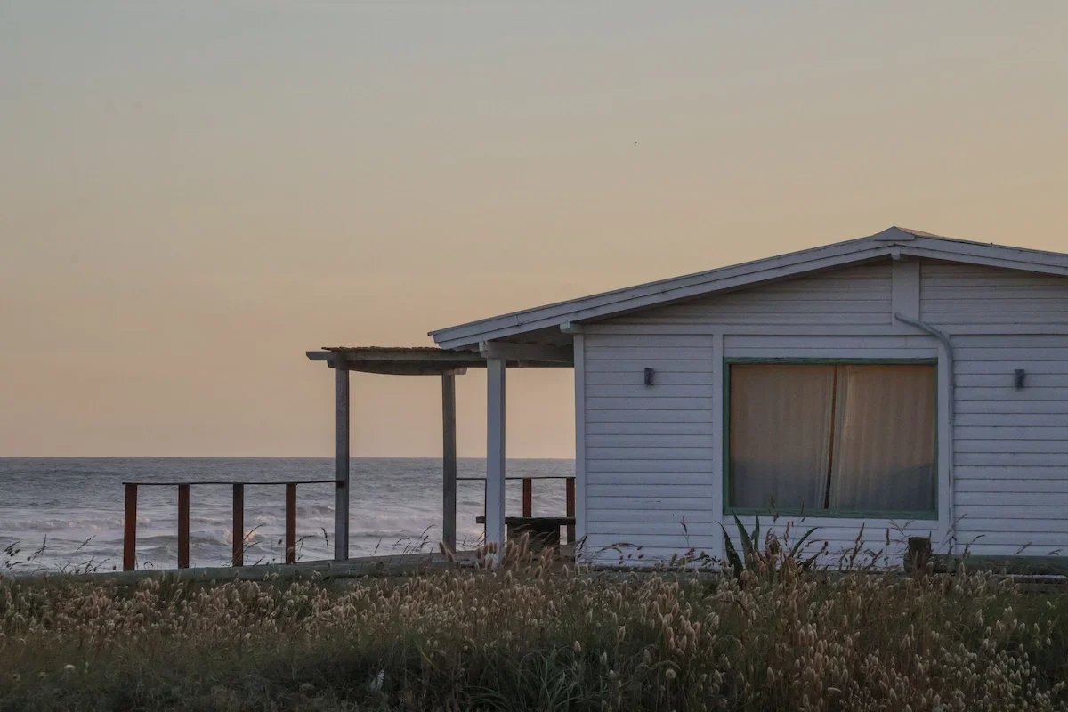
White beach house closed shutters dusk coastal, fine art photography archival framing limited edition
Frequently asked questions
How should fine art photography be framed?
Fine art photography should be framed with conservation-grade materials: acid-free mount board, UV-protective glazing, and archival backing. The frame profile and colour should complete the image rather than compete with it — a black frame is the most common and most frequently correct choice for contemporary fine art photography. The mount depth should give the print room to breathe visually. For any work intended to last generations, conservation framing is the baseline, not a premium option.
What kind of frame works best for fine art photography?
A frame that the eye passes through rather than rests on. For most contemporary fine art photography, this means a black frame in a profile proportional to the scale of the work — thinner for smaller formats, deeper for larger ones. The finish matters: flat matte recedes, gloss reflects. Ornate or heavily decorative frames impose a historical register that rarely serves contemporary photographic work. The test is simple: after hanging the work, does the frame disappear into the experience of the image, or does it remain visible as an object?
Should fine art prints have glass or acrylic?
For fine art photography on archival paper, glass with UV protection is generally preferred over standard acrylic. Museum-grade UV-protective glass — which blocks over 99% of UV radiation — provides superior clarity and archival protection. Standard acrylic can scratch over time and may introduce a slight colour cast. Anti-reflective glass options eliminate the main objection to glass framing — reflections — while maintaining its archival advantages. The choice depends on the scale of the work and the conditions of display.
What is conservation framing for art?
Conservation framing uses materials specifically chosen to protect the artwork from deterioration over time. This includes acid-free mount board (which does not emit acids that yellow or damage paper), UV-protective glazing (which blocks the wavelengths that cause fading and colour shift), and archival backing materials. Conservation framing is the standard for any work intended to be collected, insured, or resold — because a work that has been properly protected retains its condition, and condition is a component of value.
Does framing affect art value?
Yes, in two ways. First, poor framing with non-archival materials can physically damage a print over time — yellowing mount board, acidic backing, and UV exposure all degrade the paper and inks. A work in compromised condition is worth less than the same work in pristine condition. Second, framing is part of the presentation of a collectible work — a work that arrives hand-framed to conservation standard, ready to place, signals the level of care the atelier applies to every element of the object. That signal is part of what collectors are acquiring.
Framing is where the atelier's relationship to the work ends and the collector's begins. The work arrives complete — image, print, certificate, frame — and what the collector does with it from that point is their own decision. But the decision that allows them to make that transition — the frame that connects the image to the room it will inhabit — is one that deserves the same attention as every other decision made about the work.
What you place on a wall changes the room. What frames it changes the work.
Ask about framing options.
Every work ships hand-framed from Amsterdam. Leave your name and the title of the work — you'll hear back within 24 hours with availability, framing details, and a custom mockup for your space.